Teaser Selection

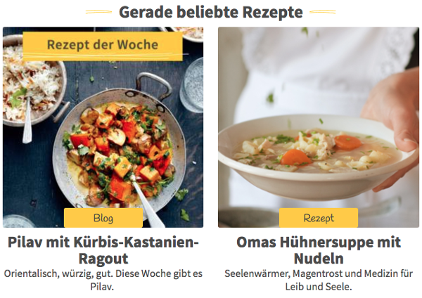
The “teaser_selection” content type is used for displaying teasers to other content in your website. These teasers could be arranged as list or grid, like in this example:

../../_images/teaser-selection-web.png

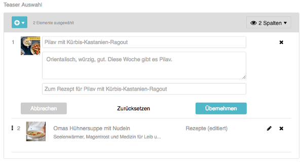
In the administration interface, the widget is displayed as a selector for the teasers. Content managers can choose a number of target contents. By default, the text from the “Excerpt & Categories” tab of the target content is shown. You can however customize the text of the teaser if you like.

../../_images/teaser-selection-admin.png

Configuration

Add a field of type “teaser_selection” to your page template:

<!-- app/Resources/templates/pages/overview.xml -->
<?xml version="1.0" ?>
<template xmlns="http://schemas.sulu.io/template/template"
          xmlns:xsi="http://www.w3.org/2001/XMLSchema-instance"
          xmlns:xi="http://www.w3.org/2001/XInclude"
          xsi:schemaLocation="http://schemas.sulu.io/template/template http://schemas.sulu.io/template/template-1.1.xsd">

    <!-- ... -->

    <properties>
        <!-- ... -->

        <property name="teasers" type="teaser_selection">
            <meta>
                <title lang="en">Teasers</title>
            </meta>
        </property>

        <!-- ... -->
    </properties>
</template>

Rendering

In Twig, the field contains an array of teasers. Iterate the array and format the teasers as you like:

<ul property="teasers">
    {% for teaser in content.teasers %}
        <li><a href="{{ sulu_content_path(teaser.url) }}">{{ teaser.title }}</a></li>
    {% endfor %}
</ul>

Each teaser is an object with the following properties:

Property

Type

Description

id

string

The ID of the teaser

type (e.g. content or article)

string

The type of the teaser

locale

string

The locale, e.g. “de_AT”

title

string

The title of the teaser. This is usually taken from the “Excerpt & Categories” tab of the target content, but can be changed for each teaser

description

string

The description of the teaser. This is usually taken from the “Excerpt & Categories” tab of the referenced content, but can be changed for each teaser

moreText

string

The text of the “More” link

mediaId

string

The ID of the image displayed with the teaser. Defaults to the first image in the tab “Excerpt & Categories”, but can be changed for each teaser

url

string

The relative URL of the target content

Parameters

The following parameters can be used to customize the field in the page template:

Parameter

Type

Description

present_as

collection

A collection of strings. Each string is typically a CSS class that is used to render the teaser list. You can configure the <title> of each entry that is shown in the admin

Configurable Presentation

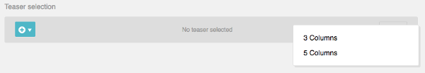
Sometimes, a content manager wants to control exactly how a list of teasers is presented. You can plan for different rendering variants in your design and let the content manager choose one variant in the administration interface.

Use the present_as option to configure the rendering variants:

<!-- app/Resources/templates/pages/overview.xml -->
<?xml version="1.0" ?>
<template xmlns="http://schemas.sulu.io/template/template"
          xmlns:xsi="http://www.w3.org/2001/XMLSchema-instance"
          xmlns:xi="http://www.w3.org/2001/XInclude"
          xsi:schemaLocation="http://schemas.sulu.io/template/template http://schemas.sulu.io/template/template-1.1.xsd">

    <!-- ... -->

    <properties>
        <!-- ... -->

        <property name="teasers" type="teaser_selection">
            <meta>
                <title lang="en">Teasers</title>
            </meta>

            <params>
                <param name="present_as" type="collection">
                    <param name="three-columns">
                        <meta>
                            <title lang="en">3 Columns</title>
                        </meta>
                    </param>
                    <param name="five-columns">
                        <meta>
                            <title lang="en">5 Columns</title>
                        </meta>
                    </param>
                </param>
            </params>
        </property>

        <!-- ... -->
    </properties>
</template>

The content manager can choose one of these variants in the administration interface:

../../_images/teaser-selection-menu.png

The selected value can be used to set the CSS class of the teaser element in Twig:

<ul property="teasers" class="{{ view.teasers.presentAs|default('') }}">
    {% for teaser in content.teasers %}
        <li><a href="{{ sulu_content_path(teaser.url) }}">{{ teaser.title }}</a></li>
    {% endfor %}
</ul>

Custom Content with Teaser Providers

If you want to display teasers of custom data, create an implementation of TeaserProviderInterface. For example, we’ll make it possible to select from a list of recipes:

<?php

namespace AppBundle\Teaser;

use Sulu\Bundle\ContentBundle\Teaser\Configuration\TeaserConfiguration;
use Sulu\Bundle\ContentBundle\Teaser\Provider\TeaserProviderInterface;
use Sulu\Bundle\ContentBundle\Teaser\Teaser;

class RecipeTeaserProvider implements TeaserProviderInterface
{
    /**
     * Returns the configuration for rendering the teaser provider in the
     * administration interface
     *
     * @return TeaserProvider
     */
    public function getConfiguration()
    {
        return new TeaserConfiguration(
            // The title in the dropdown of the administration interface
            'Recipe',
            // The JavaScript component started for selecting the content
            // In this case, we use the generic list component
            'teaser-selection/list@sulucontent',
            [                                 // Options of the JavaScript component
                'url' => '/admin/api/recipe', // The API URL
                'resultKey' => 'recipes',     // The key in the JSON returned by the API
                'searchFields' => ['title'],  // The fields passed to the API when filtering for content
                'matchings' => [              // The columns shown in the list
                    [
                        'content' => 'Title', // The column title
                        'name' => 'title',    // The field shown in the column
                    ],
                    [
                        'content' => 'Rating',
                        'name' => 'rating',
                    ],
                ],
            ]
        );
    }

    /**
     * Returns the actual teaser data.
     *
     * @return Teaser[] The teasers
     */
    public function find(array $ids, $locale)
    {
        if (0 === count($ids)) {
            return [];
        }

        $items = ...; // load items by id

        foreach ($items as $item) {
            $result[] = new Teaser(...);
        }

        return $result;
    }
}

Register the provider in Symfony’s service container and tag it with sulu.teaser.provider to make it functional:

<service id="recipe_teaser_provider" class="AppBundle\Teaser\RecipeTeaserProvider">
    <tag name="sulu.teaser.provider" alias="{your teaser-type}"/>
</service>

Custom JavaScript Components

A teaser selection component is an AuraJS component that provides functionality to select and deselect items.

The following is a simple (and incomplete) example. If you want to see a full example, take a look at the components teaser-selection/content@sulucontent and teaser-selection/list@sulucontent.

define(function() {

    'use strict';

    return {
        initialize: function() {
            var $container = $('<div/>');
            this.$el.append($container);

            this.sandbox.start(
                [
                    {
                        name: 'column-navigation@husky',
                        options: {
                            el: $container,
                            url: ..., // your api url
                            instanceName: this.options.instanceName,
                            actionIcon: 'fa-plus-circle',
                            resultKey: ..., // your api result-key
                            showOptions: false,
                            responsive: false,
                            markable: true,
                            sortable: false,
                            premarkedIds: _.map(this.options.data, function(item) {
                                return item.id;
                            }),
                            actionCallback: function(item) {
                                this.options.selectCallback({type: '...', id: item.id}); // your teaser-type
                            }.bind(this)
                        }
                    }
                ]
            );
        }
    };
});